
Creating Cosy Winter Rooms with Dark Colours
During the colder months, our homes naturally take on a different role. They become places of retreat, somewhere to slow down, shut the door, and feel held by the space around us. We find one of the most effective ways to create that sense of warmth and comfort is by embracing darker colours. When used thoughtfully, deeper hues do not make rooms feel smaller or gloomier. Instead, they make them feel intriguing, enveloping, and quietly luxurious.
Dark colours work particularly well in winter because they absorb light rather than reflect it. In a season where natural light is limited, this can feel counterintuitive, but it is precisely what creates atmosphere. Deep greens, inky blues, aubergines and earthy browns soften the edges of a room and blur harsh contrasts. The result is a space that feels calm and grounded rather than stark or overexposed.
The Art of Colour Drenching
At Howark, paint is often the starting point on a project. Rich, saturated tones on walls and even ceilings can instantly shift the mood of a room and influence the other interior design decisions within the space. Colour drenching, where walls, woodwork, and ceilings are painted in the same shade, is especially effective in spaces such as living rooms, bedrooms, and snug areas and something we often use on interior design projects. It removes visual interruptions and creates a cocooning effect that feels both modern and timeless. Matte or chalky finishes tend to enhance this softness, avoiding unwanted glare in low light.
We often take this approach when designing holiday homes, cabins, and ski chalets, where the goal is often comfort and escape rather than everyday practicality, allowing us to indulge in bolder design decisions. In these settings, more intense colours help blur the line between interior and landscape, echoing forests, mountains, beaches and skylines. A deep green living room in a chalet or a smoky blue bedroom in a beach house can feel both grounding and transportive, reinforcing the sense of being away from daily life. These spaces benefit from a slightly more immersive design language, where warmth and mood take priority over neutrality.
Lighting & Texture: The Secret Ingredients
We find texture is essential when working with darker palettes, without it a room can feel flat. Layering materials is crucial to our interior design schemes and brings depth and warmth to spaces. Velvet sofas, wool throws, shearling cushions, boucle armchairs, heavy linen curtains, and hand knotted rugs all play a role. Wood is equally important with walnut, oak, or reclaimed timber adding warmth and preventing darker rooms from feeling too cool or severe. In chalets and alpine homes especially, natural materials help anchor darker colours and create a sense of authenticity.
Lighting is another key consideration on interior design projects. Dark rooms demand intentional lighting rather than a single overhead source which can be unflattering. Multiple light points such as table lamps, wall lights, and floor lamps create pools of warmth and allow the room to feel inviting at any hour. Warm bulbs are essential. Firelight, where possible, or candlelight further enhances the sense of ease and ritual during winter evenings.
Finally, at Howark we feel contrast should be used thoughtfully. Lighter accents such as stoneware, artwork with negative space, aged brass, or soft off white upholstery can lift a dark scheme without disrupting its mood. The goal is not drama for its own sake, but balance.
Whether in a primary home or a winter retreat, dark colours, layered textures, and warm lighting create spaces that invite you to stay in, slow down, and truly settle. In winter, cosiness is not about excess. It is about depth.
Deeper Palettes: Projects We Love
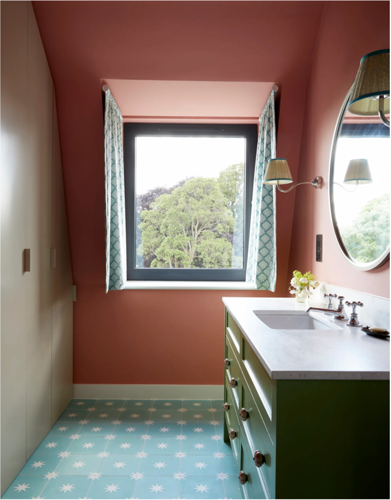
In this Howark project, we utilised a deep cocooning pink for a fun kids bathroom, which felt cosy all year round and contrasted well with the other vibrant features in the room.
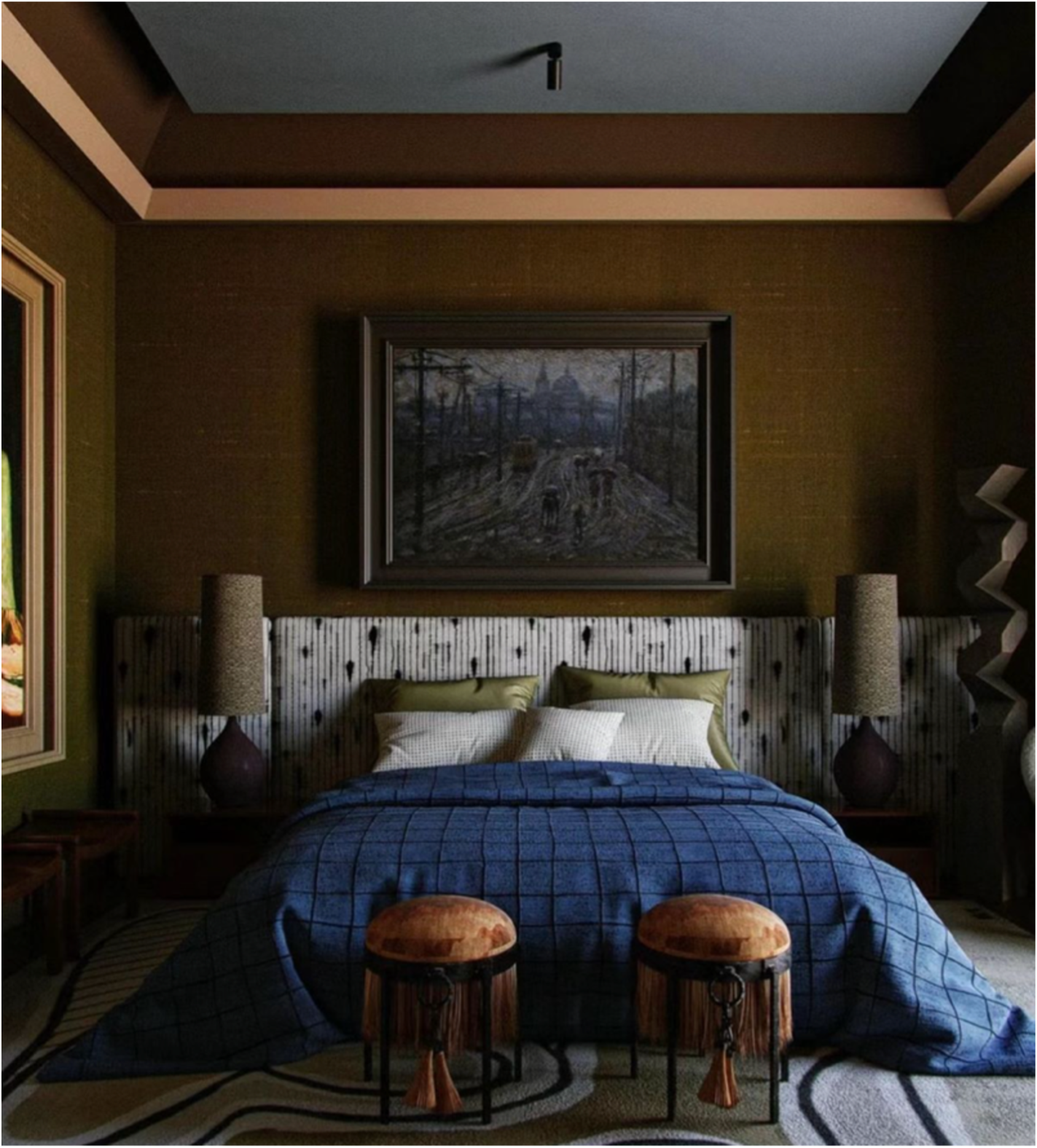
In this bedroom we love the contrast of the lighter headboard against the deep olive fabric coloured walls.